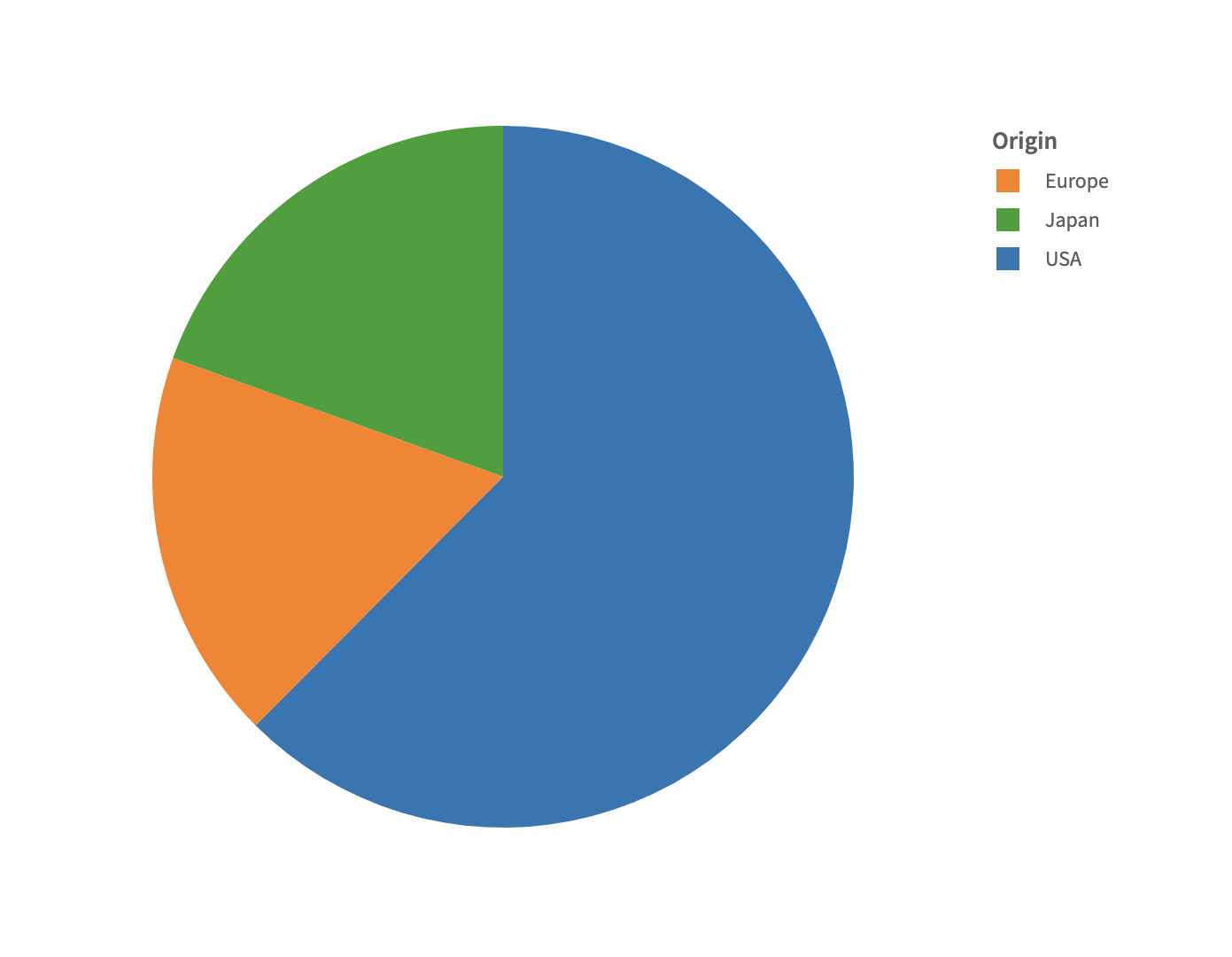
Introduction to Arc Layer
What is a arc layer?
The arc layer is the most different of all the layers, in that it does not follow (x, y) cartesian coordinate system, rather it uses the polar coordinates. By dividing a circular structure, it provides the basis of charts like pie chart, donut chart etc. Arc layer has different encodings altogether. Since this layer comes from polar coordinate the planer encodings are radius and angle.
Example
const { muze, getDataFromSearchQuery } = viz;

const data = getDataFromSearchQuery();

muze
  .canvas()
  .rows([])
  .columns([])
  .layers([
    {
      mark: "arc",
      encoding: {
        angle: "Horsepower",
      },
    },
  ])
  .color("Origin")
  .data(data)
  .mount("#chart");
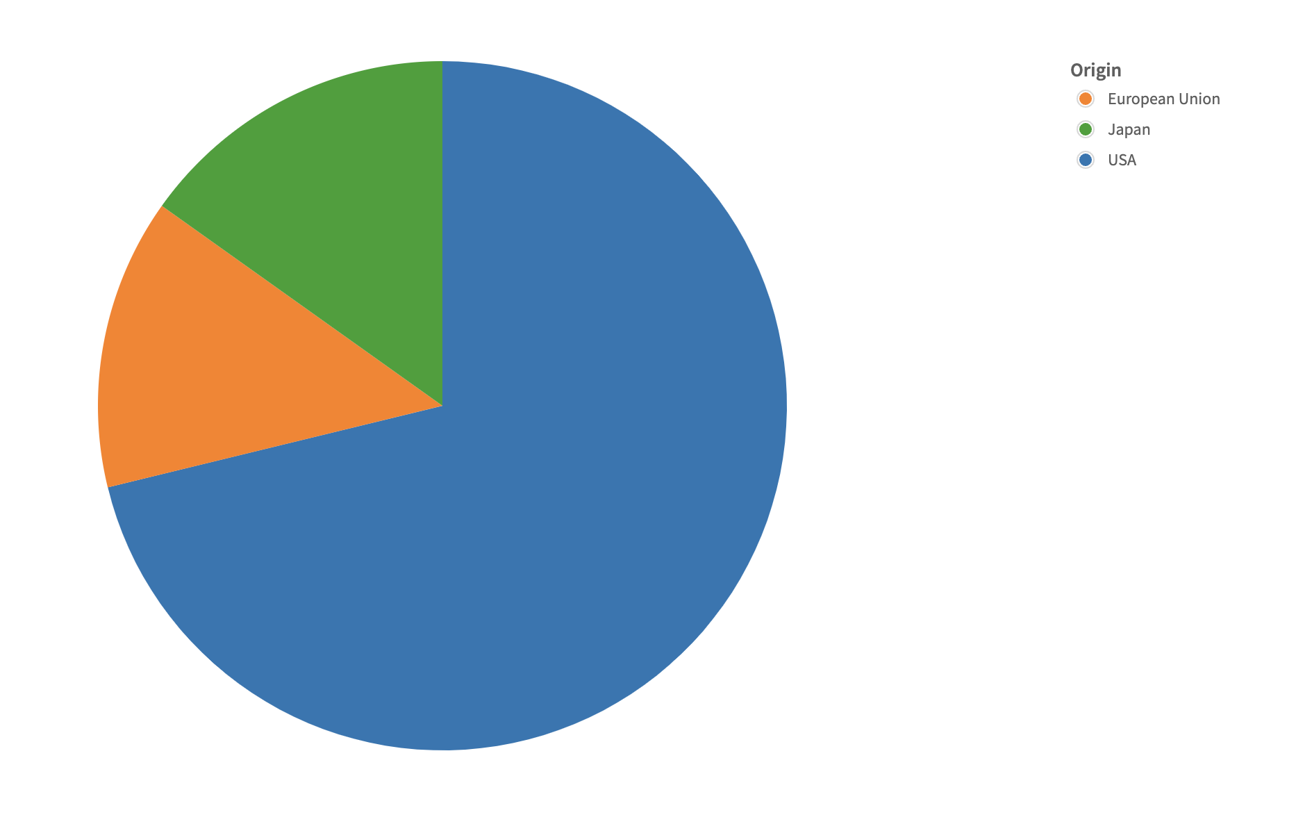
Creating a pie chart
A pie chart needs the angle field in the layer config to render.
Example
const { muze, getDataFromSearchQuery } = viz;

const data = getDataFromSearchQuery();
let dm = new DataModel(data);

const carCountDM = dm.calculateVariable(
  {
    name: "carCount",
    type: "measure",
  },
  ["Name"],
  () => 1,
);

muze
  .canvas()
  .rows([])
  .columns([])
  .color("Origin")
  .layers([
    {
      mark: "arc",
      encoding: {
        angle: "carCount",
      },
    },
  ])
  .data(carCountDM)
  .mount("#chart");
NOTE: Not all kind of data are suitable for pie. Here, in the data there is no field which we can use to form a meaningful pie chart. Hence we have calculated count of cars per country Origin which could be plotted in a pie chart.
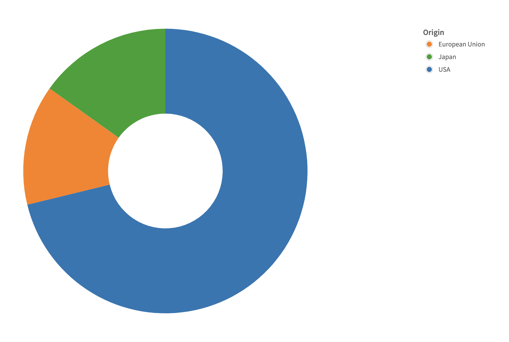
Creating a donut chart
For a donut chart, we need to alter the inner radius of the chart, such that a hollow space appears in the centre of the chart. Here, we increase the inner radius of the axes while keeping the outer radius the same.
Example
const { muze, getDataFromSearchQuery } = viz;

const data = getDataFromSearchQuery();

muze
  .canvas()
  .rows([])
  .columns([])
  .color("Origin")
  .layers([
    {
      mark: "arc",
      encoding: {
        angle: "Horsepower",
        radius: {
          range: function range(_range) {
            return [_range[0] + 100, _range[1]];
          },
        },
      },
    },
  ])
  .data(data)
  .mount("#chart");
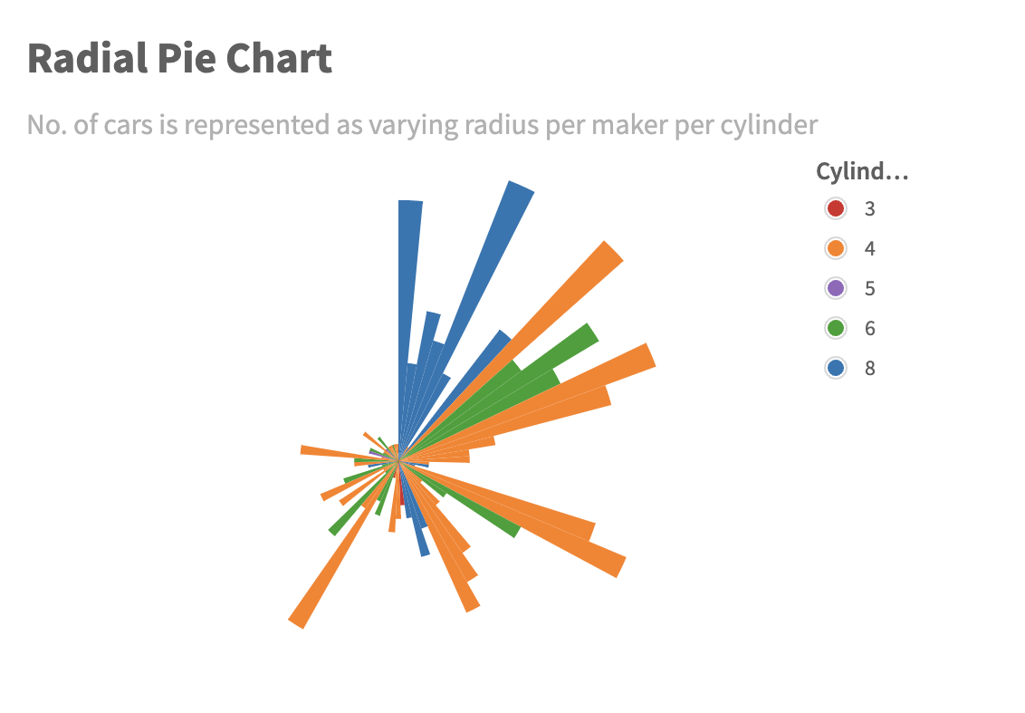
Creating a polar chart with variable angle and radius
Adding a radius to the layer encoding in a pie chart, creates a polar chart with variable angle and radius. Here the length of each angle is on the No. of cars variable.
Example
const { muze, getDataFromSearchQuery } = viz;

const data = getDataFromSearchQuery();

muze
  .canvas()
  .rows([])
  .columns([])
  .color("Cylinders")
  .layers([
    {
      mark: "arc",
      encoding: {
        radius: "No. of cars",
        angle: "Maker",
      },
    },
  ])
  .title("Radial Pie Chart")
  .subtitle(
    "No. of cars is represented as varying radius per maker per cylinder",
  )
  .data(dmWithCount)
  .width(500)
  .height(400)
  .mount("#chart");